How brands can change their assets without losing their identity /
Remember, it’s a corporate guideline, not a rule. Getting creative with your assets can drive results too, says Alex Jenkins
There’s an oft-quoted line about half the money being spent on advertising being wasted, but no one knowing which half. Here’s a suggestion: how about the half that no one can attribute to the correct brand?
The Measure Your Distinctive Assets report from Ehrenberg-Bass cheerfully advises that, ‘For any piece of brand communication to work, people must be able to identify the brand that is being advertised. This is a vital goal of any execution.’
So far, so obvious. Then comes the kicker: ‘Yet figures routinely show that, on average, half the people who see an advertisement fail to correctly identify the brand.’
Ouch.
Obviously the first step to remedying this is to ensure that your visuals are recognisable and linked to your brand, an outcome of using them regularly and consistently. But regularity and consistency aren’t words typically associated with creativity. Quite the opposite. Having rescued brand recognition by sticking unwaveringly to corporate identity guidelines, you could risk failing a more fundamental task: simply getting attention in the first place.
Advertising needs to cut through and to build memory structures…and in that order
Karen Nelson-Field
As UK ad legend Dave Trott is fond of observing, ‘If you don’t have impact, fuck all happens – 90% of advertising fails at impact, it doesn’t even get on the radar.’ But, of course, simply getting attention isn’t enough. Karen Nelson-Field advises that, ‘Advertising needs to cut through and to build memory structures… and in that order.’ Creativity is still a brand’s best shot at getting that impact and cut-through, but it’s the regularity and the consistency that aid with the memory structures.
So do brands have to trade off creativity against the need for visual repetition? Not entirely. There are plenty of brands that have used their iconic assets in creative and attention-grabbing ways. In 2011, Coca-Cola – one of the world’s most visually recognisable brands – drove a 4% increase in volume sales in Australia when it launched its Share a Coke campaign, swapping the brand name for 150 of the most popular people’s names on its cans.
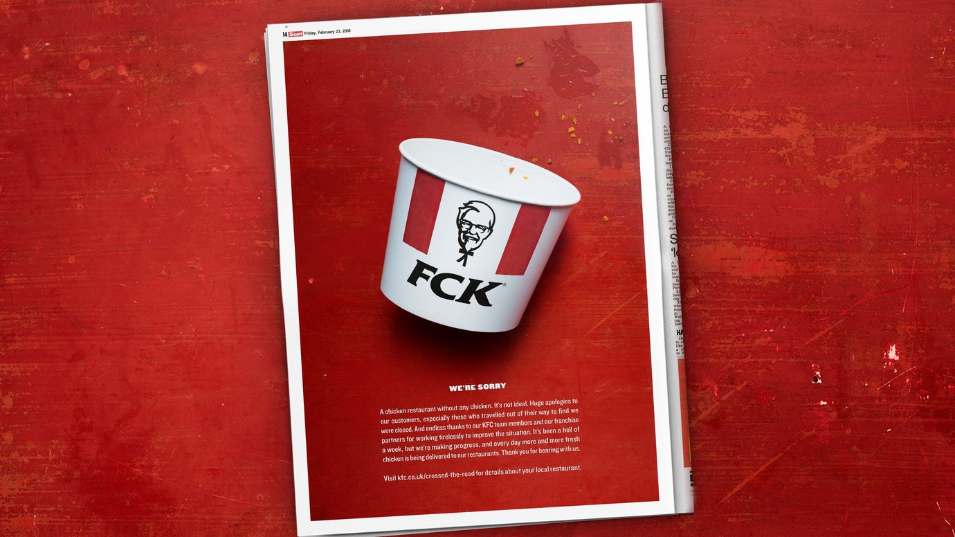
More recently, KFC in the UK turned a PR disaster into an earned-media win by subtly tweaking its logo in a print ad. Following a shortage of chicken in February, the fast-food chain had to close more than 900 outlets. The apologetic ad, created with Mother, London, simply showed an empty chicken bucket with the letters rearranged to spell FCK.
Despite only running once in two newspapers, the ad generated more than 1 billion impressions. Meg Farren, KFC CMO for UK & Ireland, told Contagious, ‘In being so bold with our creative, the ad was shareable, both in social and by news media commenting. We didn’t post the FCK ad on any of our official channels, so that reach was 100% organic.’
In fact, the fast-food category seems to be leading the way when it comes to such playful use of iconic assets. McDonald’s in Canada, with agency Cossette, Toronto, won the Grand Prix in Outdoor at this year’s Cannes Lions with its Follow the Arches campaign. By showing just a portion of its famous golden arches logo, the highway billboards clearly indicated to drivers where the nearest McDonald’s was in a way that was instantly recognisable as the brand.
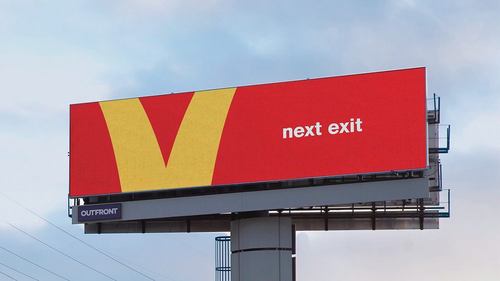
Speaking at the press conference, Outdoor jury president Chris Garbutt observed: ‘McDonald’s took something and reframed it… It’s iconic. It’s confident.’
Meanwhile, McDonald’s found another of its distinctive assets on the receiving end of some guerilla appropriation. Last Halloween saw Burger King take a swing at Ronald McDonald himself with Scary Clown Night. With 2017’s film adaptation of Stephen King’s It driving sales of creepy clown costumes, Lola MullenLowe Madrid’s campaign rewarded people with a free Whopper if they came to BK restaurants dressed up as clowns. While the campaign potentially risked reminding people of the brand’s main competitor, in reality the stunt proved to be a kind of marketing martial art, using McDonald’s famous trademark against it.
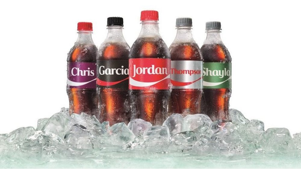
The key to the success of these campaigns is their balance. All of these brands have spent years building up visual recognition. Coca-Cola has used its trademark red since the 1890s and the company’s website boasts: ‘Consumers almost universally identify the very sight of red and white with Coca-Cola as it is standard on vending machines, signage, vehicles, dispensers, coolers and packaging.’ And that’s the point. Years of consistency across multiple touchpoints earns brands the right to be more creative with their assets.
The trick is in retaining enough that is recognisable while exploring how to use that powerfully to create impact and gain attention.
Byron Sharp’s bible of marketing, How Brands Grow, advises that, ‘Distinctive assets represent a considerable competitive advantage to brands.’ It’s easy to interpret that purely on the building-memory-structures side of the brand growth equation. Just don’t lose sight of their creative potential too.
Want to create better, braver work? Join us at Most Contagious USA on 27 Jan where we’ll distil a year’s worth of advertising campaigns, insights and trends into a day of inspirational talks. Click here for the line-up and tickets.
Want more of the same? /
We don’t just write about best-in-class campaigns, interviews and trends. Our Members also receive access to briefings, online training, webinars, live events and much more.
