Slack's Editorial Soul: Anna Pickard on Writing the Brand Experience /
Slack has quickly built a massive base of fans, here's how

Anna Pickard is editorial director at Slack, the rapid-rising team communication software launched last year by former Flickr co-founder Stewart Butterfield. Slack, which counts us at Contagious among its customers, has quickly built a massive base of fans with creative interfaces, helpful features and a great brand personality.
After a degree in dramaturgy, Anna did a stint at the Guardian, became the Twitter voice of a cat with thumbs and wrote the trippy world of Glitch before contributing to the emoji-conscious voice of Slack. Anna's going to be talking about constructing an amazing editorial experience for digital products at Now / Next / Why, giving voice to bits and bytes; we caught up to her via email to ask about her approach, and some of her favourite brand experiences.

How does editorial style help join up the experience around Slack, and bolster the broader brand?
There’s a sense of recognition, the same simple, straightforward language that helps you in the onboarding process is the one that carries you through every interaction. It is sometimes funny, sometimes serious, sometimes just plain and informative, but throughout, it should feel like nothing more than a person, talking to another person. Human to human.
The voice and design are woven tightly together. The bright colours of the logo and playfulness of animations match the tone of the copy in the product and all around it. The tone was set early on – it’s very much in the voice of Stewart Butterfield (and the other founders) and my work has been in learning how to scale and expand this without losing the sense that you were talking to a friendly co-worker.
That’s the main thing, really: this is a communication tool for teams. The way that we’ve built it, the way we’ve worked on building a friendly community around it, making sure we’re treating people with respect, empathy and courtesy all the way through: it’s all those things that make Slack feel like a member of the team, not just a piece of software supporting your team. We want people to like using Slack, and to want to share the experience. We want people to understand what they’re using, and never stop learning about it. The tone of editorial copy that surrounds and is woven through Slack is, for us, a vital part of supporting the product and the mission of the team behind it.
What’s your approach to maintaining a style guide, or a canon that helps guide those sorts of interactions and messages?
We’ve been building a style guide over the last six months, attempting to distill everything that already exists through a mixture of instinct and design and helping it to scale as we expand the writing, marketing and support teams (and everywhere else) fast.
As someone who has come from a mixed background involving theatre, journalism, games writing, academia and a little bit of advertising and social media management, style guides are things that I’ve worked with often, but never had to create. I was very grateful to Mailchimp for its public style guide, and have used a lot of the same techniques in helping to pin down the Slack Voice for anyone coming in to the company. The ‘This But Not That' list is particularly useful in getting people to pin down what the voice is.
It helps that we have a lot of people who care about words here. We love ’em. The founders of the company more than (almost) anyone else. It’s been baked in to Slack from the start (and before).
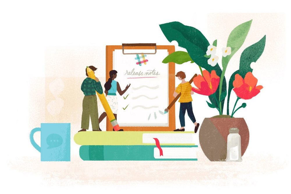
And while it’s good to have the solid document of a style guide, there’s a huge amount of collaboration and feedback that goes into wording for Slack. So our #editorial channel includes writers, people on the support team, developers, designers, managers and the company’s founders – all of whom have an opinion. So we’ll drop a couple of versions of a tweet in there to take a vote, or ask for emoji suggestions (we like to think we’re tight on our emoji game), or a quick proofread of a blog post (because US punctuation is still not natural to me, and the occasional indecipherably British turn of phrase slips in), or a sanity check on release notes. Or we just sit in there and argue about the Oxford comma. Obviously.
Blog posts are put together in channels, pulling in the people in the company that need to have input, and anyone else interested in getting it together, and where we drop drafts, assets, tweets and messages made in other channels that might be pertinent – and that transparency in how the process of writing anything for Slack helps (I believe) create a greater understanding and feeling for using the Slack voice in anything they need to write.
It’s not just writers writing drafts of things no one ever sees. Everything’s out in the open, so everyone has a chance to say ‘that doesn’t sound Slacky. If we used this word, would it be Slackier?'

So then how do you approach the Slack voice on external platforms, like Twitter, where you guys seem particularly fun and clever?
While we like to believe there’s one very distinctive and distinguishable Slack voice, there are different levels of tone inside it. Twitter is probably the most casual, and certainly the freest with emoji, of all.
There are a small number of people who write our public tweets, but a team of more than a dozen people on the team replying on twitter at different parts of the day (and others on rotation or on ad hoc support when needed, everyone at the company does support shifts.)
There are sections of the style guide for every kind of writing at Slack. The Twitter segment, unsurprisingly, is one of the longer sections. Twitter’s important to us. A lot of the people on this team have been on Twitter since day one. As almost all our growth so far has been organic and driven by word of mouth, we want to make sure that every single interaction you have with us feels not only recognisably Slack in nature, but also something that would help you want to recommend Slack to others. Of all social media (or socials media? Is it like passers by?) Twitter is where SlackHQ feels at home. It is our jam, if you will.
So there are lots of notes on tone and example tweets, what we engage with, what we don’t, when to emojize (always if you can, and as creatively as you can, unless it’s inappropriate), and when to simply admit that we’re really not needed in a conversation, and to let things go. And, reiterating the point before, all this plays out collaboratively in Slack as well. All the tweets come in, we talk about the best way to reply to various questions, pass feedback directly on, question responses when they don’t quite hit the mark, and applaud each other when they do.
And then there are the public tweets and release notes (which are an extension of this), but I’ll go into those in more detail in my talk.
OK, so what does ‘brand experience’ mean to you? Why is it important?
For me it means a lack of friction. A sense of getting quickly and easily to the thing that I need, and not feeling patronized, heckled or harangued in the process.
What’s the number one mistake you see brands making in their attempts to create more customer-focused experiences?
Not meeting people where they are, but instead pushing personality or agenda ahead of the present need of the customer.
Being over-familar. Too chummy. Too intimate. Speaking when they’re not being spoken to, when people are talking about you, not to you, know when not to butt in, because 80% of the time it’s not 'delight and surprise', it’s just rude.
Hitting 'reply' too soon – it’s important to not get complacent, but to listen to your instincts and to check the context of conversations. We all know social media (or we should, by now) well enough to know that you can’t always get people’s tone, and especially when someone is really frustrated with you or your product or service, it’s worth taking a couple of minutes to check their feed and get a measure of how to talk to them like a person.
Not knowing the line between 'engagement' and knowing when to stop engaging.
You said ‘number one mistake’. Sorry. I’m a better writer than I am an editor, please note.
Who, other than Slack, is nailing brand experience right now?
Lots of people! But to name a few, Zendesk, Mailchimp, Grubhub have a few lovely touches, and personally I love Boden, who pitch things so well for their audience.
What current marketing buzzword or trend is the least important, in your mind?
I literally have no idea. Is that bad? I only started working under an official ‘Marketing’umbrella this year, and I’m still trying to work out what so much of these words mean (while trying to remain ignorant enough to never stop questioning whether these are the most logical words to use. I don’t care about buzzwords. I care about doing a good job for the people I want to talk to, human to human: The people who use Slack.)
But there are words I hate (growth-hacking, disruption, provocation, rock-stars…) but honestly I don’t know enough to… oh who am I kidding? It’s growth-hacking. That's not a thing. That’s just mouth-farting.
Want more of the same? /
We don’t just write about best-in-class campaigns, interviews and trends. Our Members also receive access to briefings, online training, webinars, live events and much more.


